The interface
This page describes the participant's negotiation page in detail: the same page serves /app (logged-in users) and /play (the playground and Prolific participants). For a guided first run, see the quick start.
Pages and routes
| Path | What it shows |
|---|---|
/app |
The negotiation page for a logged-in user. Redirects to /login when you are not logged in, and to /consent when consent is required and not yet given. |
/play |
The negotiation page without an account (also served at /guest and /hanplay). With ?PROLIFIC_PID=... it runs a Prolific study session. |
/login, /register, /consent |
Sign-in, account creation and the consent form. |
/admin |
The admin console. |
/ |
Redirects to /app, keeping the query string. |
Each browser keeps one session per page. Reloading reconnects to the same session; if the connection drops, a "Reconnecting…" bar appears under the header and the page reconnects on its own.
The header
From left to right the header shows:
- the title (from
titleinenv.json, default "HANI2"); - the scenario title, "You are the ⟨role⟩", the round label ("Negotiation 2", or "Practice negotiation" in a Prolific practice round), the partner's name when it may be shown, and an Admin badge for administrators;
- the timer: a progress bar, the time left (or "No limit"), and "Round n of N". The timer turns red in the last ten seconds;
- the Autopilot button and driver selector, when autopilot is allowed (see Autopilot);
- the Assistant button, when a support agent is attached to the session. Its dot is green when the assistant is on, amber while it works and grey when it is off;
- the layout menu, the settings button, the theme button (system, light, dark), and the account menu with your name, a link to Administration for admins, and Log out on
/app.
The partner's (opponent agent's) name appears when the session is in admin mode or when the admin setting show_opponent_type is on.
Layout views
The layout menu offers three views. The current view is part of the session state, so a support agent can change it too.
| View | Desktop layout |
|---|---|
full |
A left column with the upper and lower tool panes. On the right, the thread runs across the top; below it sit the action dock and, next to it, the side pane with the offer generators (such as the Utility-based Selector), so the tools that fill your offer are beside the offer editor. |
simple |
The thread and action dock, plus one tools column on the right with the tools from all three panes. |
focus |
The thread and action dock only. |
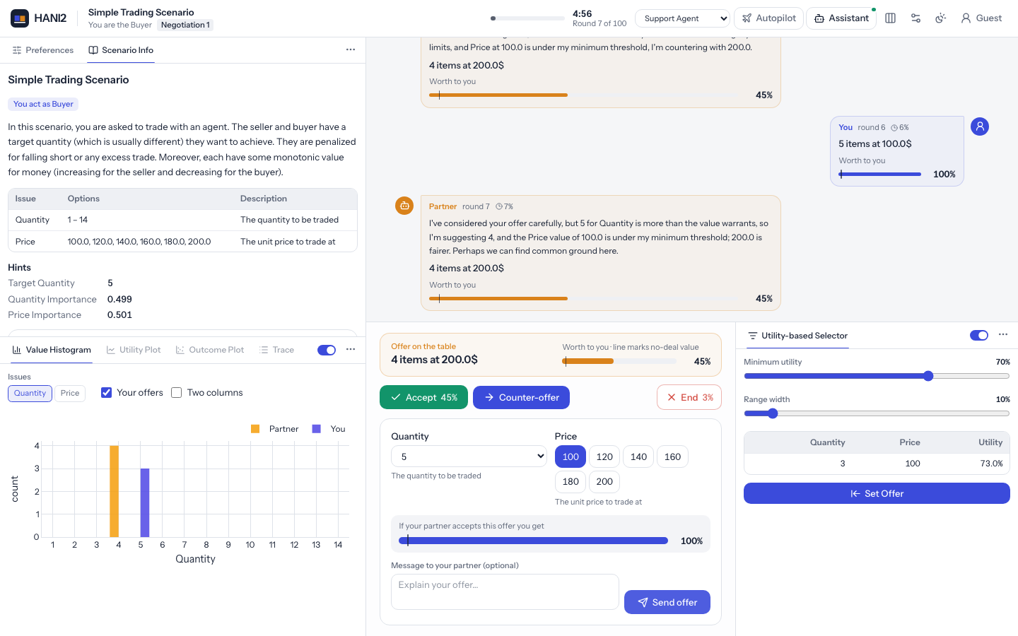
Add ?view=full, ?view=simple or ?view=focus to the URL to choose the starting view. A region listed in layout.collapsed (tools or side) is hidden; the support agent's layout control sets it.
Resizing the panes
Drag the thin dividers between the panes to change their sizes: the tools column against the negotiation, the upper tools against the lower ones, the history against the offer area, and the offer generators against the offer area (and the assistant when it is docked on wide screens). A divider highlights under the pointer. Double-click a divider, or focus it and press Home, to return to the default size; with the keyboard, focus a divider with Tab and nudge it with the arrow keys. Panes stop at sensible minimums, so the offer area never becomes too narrow to use.
The sizes are part of the session layout (layout.sizes, each a fraction of its container), so they
survive a page reload and a support agent can set them through its layout control:
| Key | What it sizes |
|---|---|
tools |
Width of the tools column (full and simple views). |
upper |
The upper tools' share of the tools column. |
dock |
The offer area's share of the height (the history gets the rest). |
side |
The offer generators' share of the row beside the offer area. |
assistant |
Width of the docked assistant. |
tablet_tools, tablet_dock, tray |
The tools column, offer area and tools tray on tablets. |
A missing key means the default size. Phones have no dividers.
Phones and tablets
The page picks one of three layouts from the screen:
| Layout | When | Arrangement |
|---|---|---|
| Desktop | 1024 pixels wide or more with a mouse; touch screens 1400 pixels or wider | The views above. |
| Tablet | 640–1023 pixels wide, or a touch screen narrower than 1400 pixels | Landscape: the thread and action dock, with one tools column (all tools as tabs, offer generators first) on the right. Portrait: the thread and action dock fill the screen and a Tools tray along the bottom expands to show the tools. The assistant slides over from the right. Focus hides the tools. |
| Phone | narrower than 640 pixels | A bottom bar with Negotiate, Tools and, when there is a support agent, Assistant; one of them at a time. |
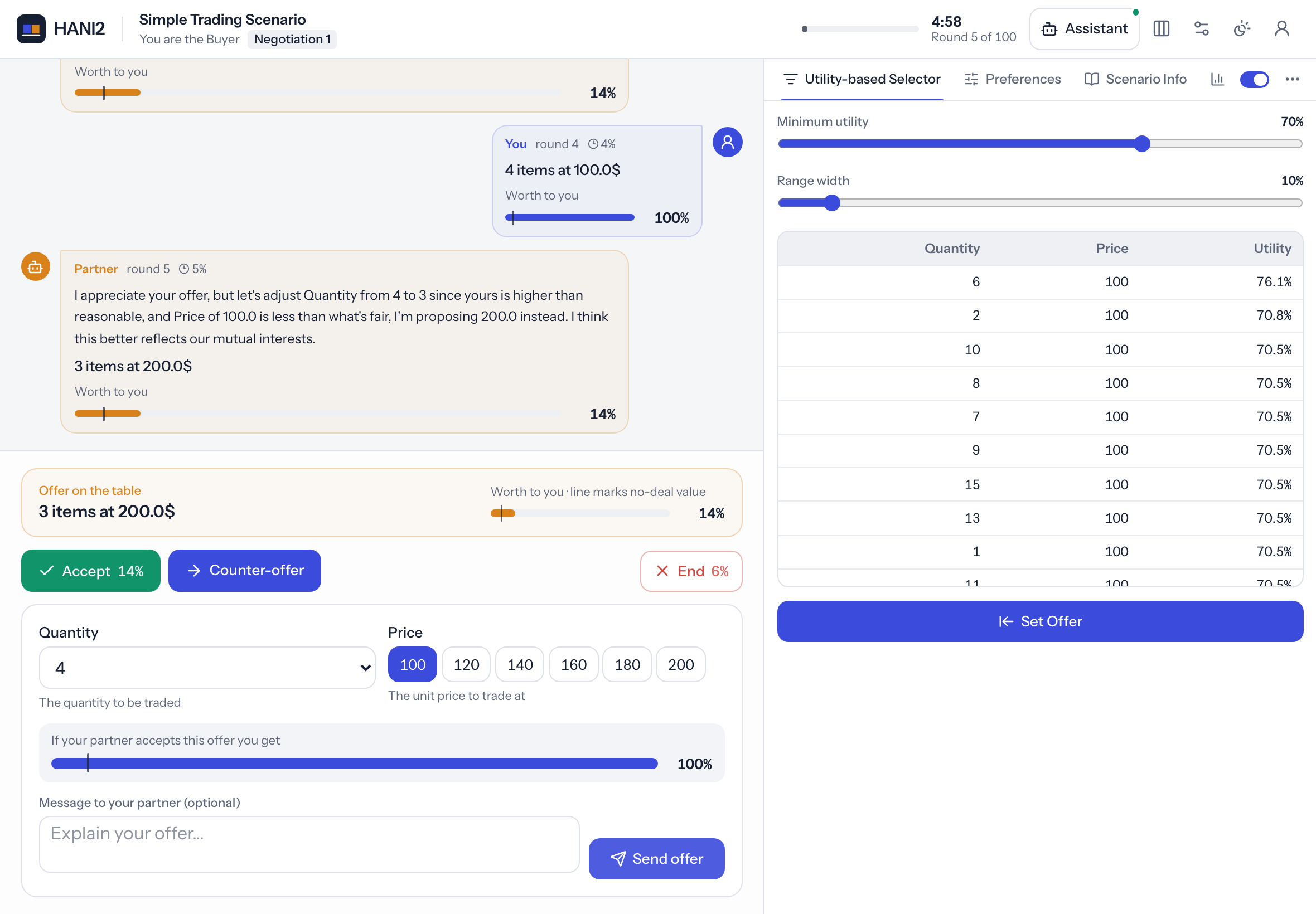
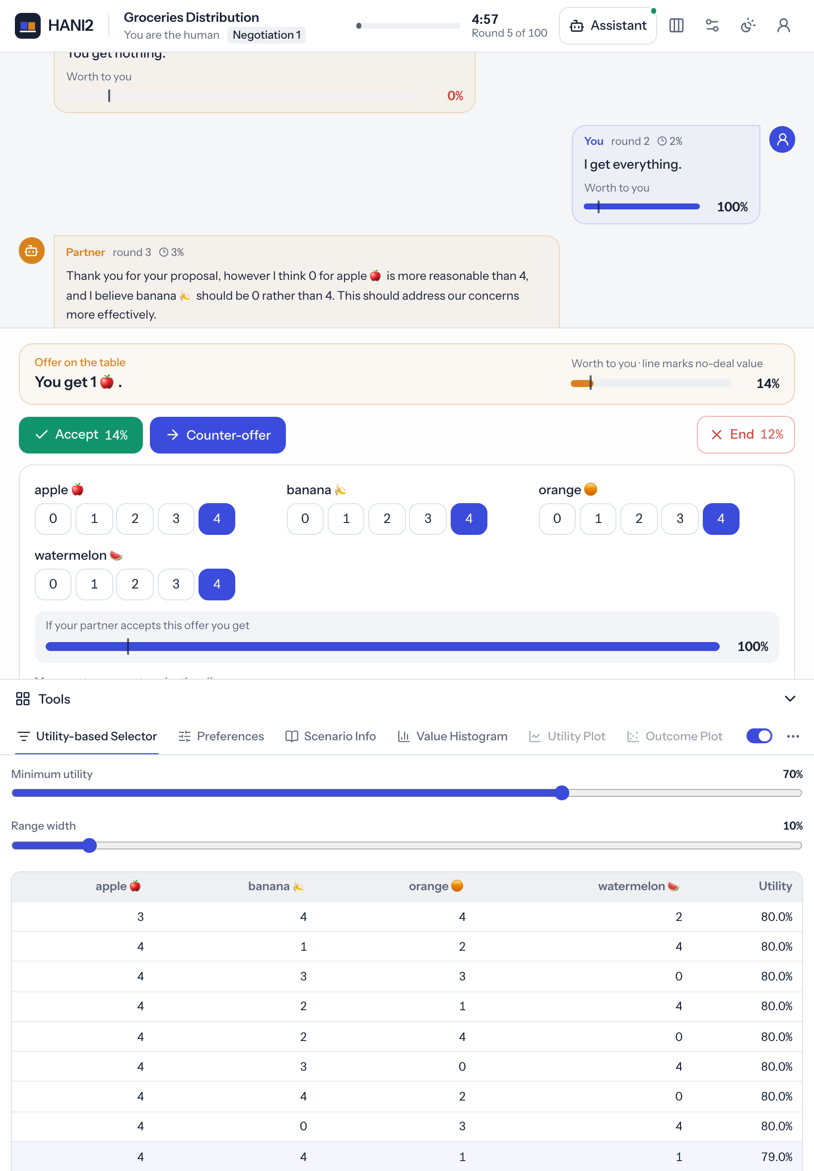
On tablets and phones buttons and inputs are taller for touch, the autopilot moves into the account menu, and the layout menu offers only Show the tools and Focus (tablets; none on phones). A participant can force a layout under Settings → Layout for (kept in the browser), and ?device=phone, ?device=tablet or ?device=desktop in the URL does the same. The layout in use is stored with every result (device and orientation columns).
Tool panes
Tools live in three panes: upper, lower and side. Each tool has a default pane, which you can change in env.json (see Tools). A pane is shown only if it has at least one tool.
Tabs
Each pane shows its tools as tabs with an icon and a name. Hover a tab to see the tool's description. Clicking a tab makes it the active tool of that pane and refreshes its content.
Tools are added at different times: some exist from the start, others appear when a scenario loads, when the negotiation starts, or when it ends. Admin-only tools appear only for administrators, and tools not marked for guests do not appear in the playground.
Enable switch
Next to the tabs is a switch that turns the active tool on or off. A tool that is off shows a lock, its description and a Turn on ⟨name⟩ button instead of its content, and its tab is dimmed. Permanent tools (such as Preferences and Scenario Info) have no switch. When the admin setting allow_tool_switch is off, the switch disappears and every tool shows its content.
Enlarge and put back
The ⤢ button next to the tabs enlarges the active tool. Depending on the admin setting
Enlarged tools open as (tools.maximize in env.json), it opens in a large window over the
page (window, the default) or fills the whole screen (fullscreen); off removes the button.
While a tool is enlarged its pane shows a Put it back here button. Put back in the enlarged
view, the close button, or Esc returns the tool to the pane it came from. Opening and returning
a tool are logged as tool_maximized and tool_restored events.
Your preferences when the negotiation starts
When a negotiation starts, your Preferences tool comes into view: it becomes the active tab of its pane (and is shown again if it was hidden), a collapsed tools column opens, and the focus view switches to the full view. On a tablet in portrait the tools tray opens, and on a phone the Tools tab opens; tap Negotiate to return to the offer.
Move, hide and restore
The ⋯ menu next to the tabs acts on the active tool:
- Move to top left / bottom left / right moves the tool to another pane and makes it that pane's active tab. These entries appear only in the full view and only when the admin setting
allow_moving_toolsis on. - Hide this tool removes its tab. Permanent tools cannot be hidden.
When a pane has hidden tools, a + button appears next to the tabs. Hover or focus it to see the hidden tools and click one to bring it back.
The server also supports restoring every hidden tool at once and bringing a tool to the front (restore and focus); the support agent uses these (see Support agent).
The history thread
The thread in the middle lists the negotiation:
- Offer bubbles: yours on the right, your partner's on the left. Each shows who made it, the round number, the share of time that had passed, the message (rendered as Markdown), the offer, any extra data the partner attached, and a small utility gauge of the offer's worth to you. An entry without offer or text reads "No offer".
- System lines: centred lines that state how the negotiation ended, green on agreement.
- Thinking indicator: "Setting up the negotiation…" or "Your partner is thinking…" while the partner moves.
The display settings change the thread: newest on top or at the bottom, your own offers shown or hidden, offers as sentences or as issue chips, and the full history or only your partner's latest offer.
The action dock
The action dock under the thread changes with the session's phase.
Before the negotiation
The dock shows the round label, the scenario title and your role. On the first round it shows the welcome text from announcements.md. A Prolific participant sees whether the next round is a practice round or how many counted rounds are done, and a countdown when the study starts the round automatically.
Buttons: Start negotiation and, outside Prolific, Different scenario (loads another scenario).
Two pickers appear in a dashed box when they apply:
- Scenario: a scenario type ("Next in order" or a type) and, after choosing a type, a scenario name, with a Load button. Shown to admins, or to everyone when the admin setting
allow_scenario_selectionis on. - Opponent for the next negotiation: a text field with suggestions from the opponent groups (suggestions load only for admins). Empty means a random partner from the pool. Shown in admin mode. See Opponents.
During the negotiation
The dock shows the offer on the table with its utility gauge, then the Accept, Counter-offer and End buttons, and the counter-offer editor when it is open. The buttons work only on your turn; otherwise "Waiting…" appears.
The utility gauge is a bar from 0% to 100% with a dark tick at your value on disagreement. The fill is blue for your offers and orange for your partner's; it turns red when the value is below the tick.
The counter-offer editor opens when you press Counter-offer, when there is no offer on the table yet, when the display setting "Keep the offer editor open" is on, or when the support agent highlights the counter-offer controls. It contains:
- one field per issue (buttons for up to six values, a drop-down for longer lists, a number box for numeric ranges), laid out in
n_issue_columnscolumns from the scenario (one to three); - a gauge of what you get if your partner accepts the draft;
- the message box, when the participant may write messages (admin setting
allow_text_human); - Send offer. Ctrl+Enter or Cmd+Enter in the message box also sends.
Admins see an extra row: Text only (send the message without an offer), Offer from message (fill the fields from the message using the LLM) and Write message (write a message for the draft using the LLM). See Language models.
While autopilot runs, the dock shows "Autopilot is negotiating for you", the driver's name, and Take back control.
After the negotiation
The dock shows "Agreement reached" and the deal, or "No agreement" and the reason, a gauge of your final utility, any study notice, and Next negotiation.
Confirmation dialogs
Accepting and ending always go through a dialog.
- Accept this offer? shows the offer, a large gauge of what you will receive, and a warning when the offer is worth less than ending the negotiation.
- End without agreement? states the value on disagreement you will receive.
The support agent can open the same dialogs, optionally with a message of its own at the top, so the participant still confirms the action.
The assistant dock
When a support agent is attached, the Assistant button opens the dock. On wide screens (1600 pixels and up) it sits beside the page; on narrower desktops it slides over the right edge; on phones it fills the Assistant tab.
The dock contains:
- the assistant's name and status ("Ready to help", "Working…" or "Switched off");
- an on/off switch. While it is off, the chat box is disabled and the assistant takes no actions;
- the conversation. Questions the assistant asks are framed, and their answer options appear as buttons; the box then reads "Type your answer…";
- panels the assistant shows inside the dock;
- the message box (Enter sends, Shift+Enter adds a line).
The dock opens by itself when the assistant asks a question or shows a panel in it.
The sliders button opens Assistant settings:
- How much may the assistant do?: Suggest, Semi or Full. Levels above what the administrator allows are disabled.
- Abilities: a switch for every capability the administrator granted.
- Unprompted messages appear as: Notifications (toasts), Status board, or Chat.
- Clear the conversation.
The support agent page explains autonomy, capabilities and proactive messages.
Agent panels
A support agent can build its own panels from the same components tools use. A panel has a title and a close button, and appears in one of three places: inside the assistant dock, above the thread ("side"), or as a modal dialog. Closing a modal or a panel tells the server, and the agent receives the panel's button presses.
Highlights and notes
A support agent (or a tool) can highlight a part of the page with a pulse, glow or spotlight effect, optionally with a message under it and a dismiss button, and attach short notes (info, tip, warning) under elements such as an issue field. Highlights clear when you act. The names of the elements that can be highlighted are listed on the support agent page.
The status board
When the assistant writes to the status board, a strip with its text appears at the bottom of the page. Use Less and More to collapse it to one line or expand it.
Toasts
Notifications appear at the top right: info, success, warning and error. They disappear after five seconds (nine for errors) unless the sender set another duration, and can be dismissed with the × button. A toast from the assistant can include a button that opens the assistant dock. The page keeps at most five toasts.
Questionnaire
If a per-negotiation questionnaire is configured, it replaces the result after each counted negotiation (not in the playground, and not after a round in which the participant took no action). Questions can be Likert scales with 5 or 7 points (with optional end labels), yes/no buttons, a drop-down, or free text. Submit answers checks that required questions are answered. See Studies and results for the file format.
Prolific completion
In a Prolific session, the dock shows study progress and notices after each round, and starts or loads rounds automatically on timers. When all counted negotiations are done (and the questionnaire answered), the dock shows "You're all done. Thank you!" and a Finish and submit button that opens the completion URL. See Prolific.
Display settings
The settings drawer (gear button) holds per-session display preferences any participant can change. They are stored in the session, so they apply to every tab of that session.
| Setting | Key | Default | Effect |
|---|---|---|---|
| Show the whole history | show_history |
on | Off: the thread shows only your partner's latest offer and system lines. |
| Show my offers in the history | show_human_offers |
on | Off: your own offers are not added to the thread. |
| Newest offer on top | last_offer_on_top |
off | Order of the thread. Off: oldest first, and the thread scrolls to the newest message as it arrives. |
| Keep the offer editor open | offer_panel_always_visible |
off | The counter-offer editor stays open. |
| Offers shown as | offer_display |
text |
text (sentences) or table (issue chips). |
| Text size | font_scale |
1.0 | Scales the page text, from 0.85 to 1.3. |
| (no control) | compact |
off | Stored but not used by the interface. |
Administrators see further sections in the drawer; see Admin console.
Admin mode
A session is in admin mode when the user is an administrator, or when the page is opened with ?admin=1 (any truthy value: 1, true, yes, on) by anyone except a Prolific participant. This works on /play and on /app. Admin mode shows the partner's name and the opponent picker. It does not grant the admin settings drawer, the admin-only tools, the admin row in the counter-offer editor, or access to the admin console; those need an administrator account.